Paintings Done in the Triad Green Redorange Blue Violet
A fter reviewing the article about blue pigments, I hesitated to attack oranges. It's true, you still have to paint too.
Then I came across a Youtube video ( https://www.youtube.com/watch?v=_HaTV0Eb-j4&t=510s ) of Follow the White Rabbit, created and presented by Anne Laure a French Artist speaking English with an accent so Frenchy ... She announces a challenge to paint 30 studies and or watercolors in 30 days, all during the month of June 2018.

I was interested in the project and after a little reflection, I decided to participate. But as you get to know me, I did not just want to do watercolors and studies. I decided to test the triads and some tetrads (4 colors).
But why this approach? Just to get a little out of my palette every day. (You find here the link to this palette type "Split or Separate" which I use the most, consisting of single-color pigments and transparent which gives beautiful vibrant and vibrant mixes.
As I have hundreds of books and nearly a thousand magazines, I started looking for possible compositions. Nita Leland, Jan Hart, Jeanne Dobbie, Hazel Soan, Tony Paul, Stephen Quiller and Jim Kosvanec are the authors of whom I have consulted the books.
It is especially in the book of Nita Leland, Exploring Color Workshop, that I found more useful information. Some books already date and make that new paints (pigments) are not referenced or commented. Too bad only English books and for francophones, there is not much to put in their mouths, maybe in 2 years when I will have finished my first book ...
_____________________
F irst a little recap. I paint 12 mixes from 3 colors. According to the color wheel, represented as a watch, the yellow is at 12H red at 4 o'clock and blue at 8 o'clock. The oranges are then at 2 o'clock, the violets at 6 o'clock and the greens at 10 o'clock.
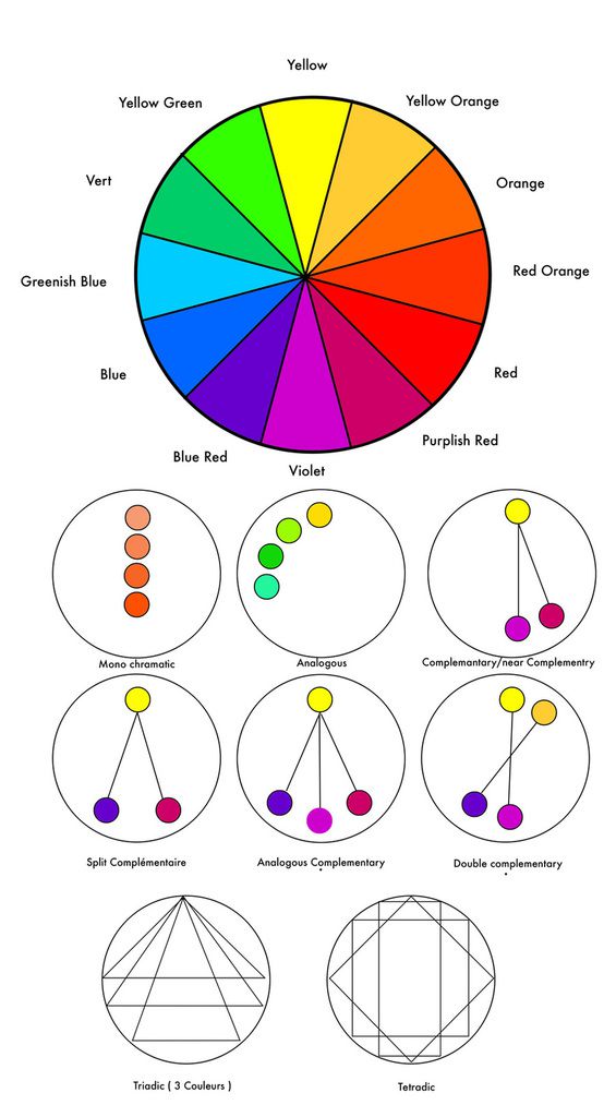
B ut back on our triad mixes. I will paint every day during the month of June a watercolor. I have a lot of pictures (I am a retired press photographer) and I will try every time to find a triad that suits the subject. Unexpectedness on the horizon ...
To introduce the art of mixing in watercolor, I painted 30 triads (a few tetrads) and I will show them and comment.
1. The traditional Triad
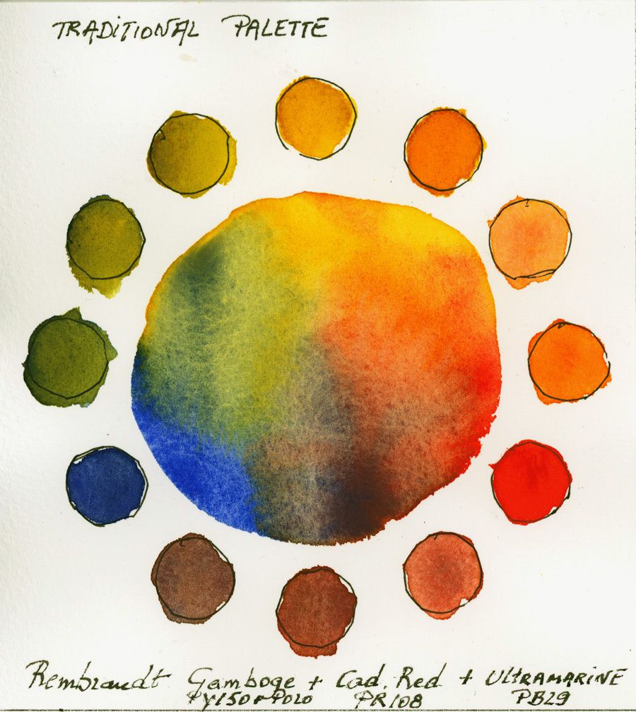
This triad, with Rembrandt colors, is composed of Gamboge <PY150 + PO20> Red Cadmium <PR108> and Ultramarine Blue <PB29>.
The Gamboge can also be changed to Indian Yellow and Cadmium Red to Pyrrole Red (more transparent, PR255 or PR254).
2. The Modern Triad
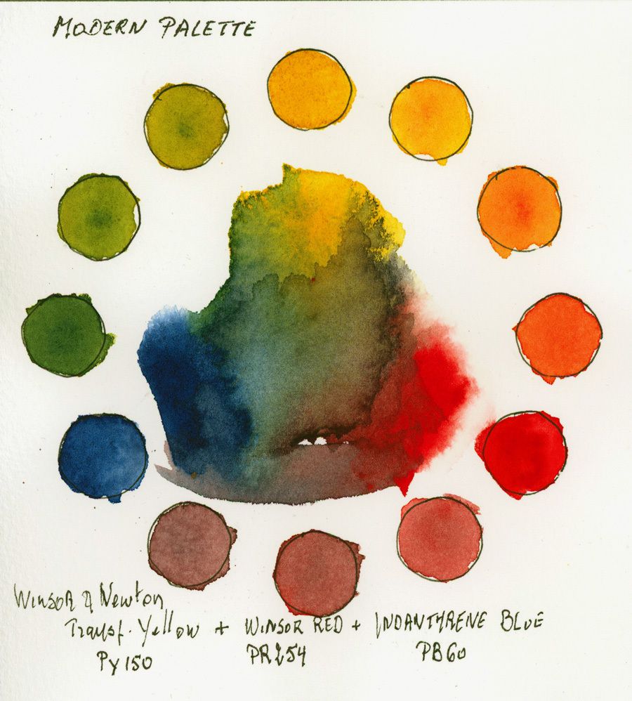
This triad, with Winsor & Newton paints, shows Transparent Yellow <PY150> Winsor Red <PR254> and Indanthrene Blue <PB60>.
It's a strong triad, denser in the dark, creating pretty natural greens but duller violets. If you want to get more pure purples, but duller oranges opt for a Magenta PV19 to replace the Red Winsor.
3. Triad: High Contrast
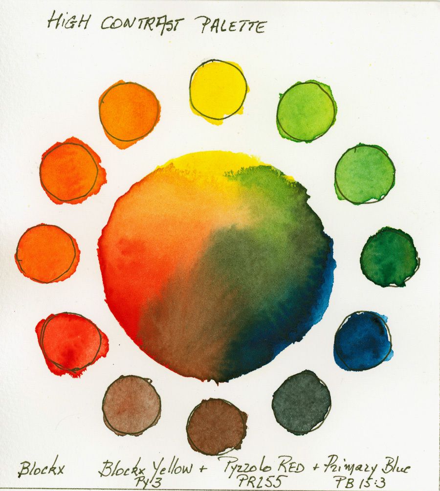
It's not for nothing that I chose here Blockx paints, which I think are one of the most powerful currently available.
The pallet is composed of Blockx Yellow <PY3> of Red PYrrolo <PR255> and Primary Blue <PB15: 3>.
I do not think we can find more vibrant. I already have an idea for its use ... a bird with multiple colors.
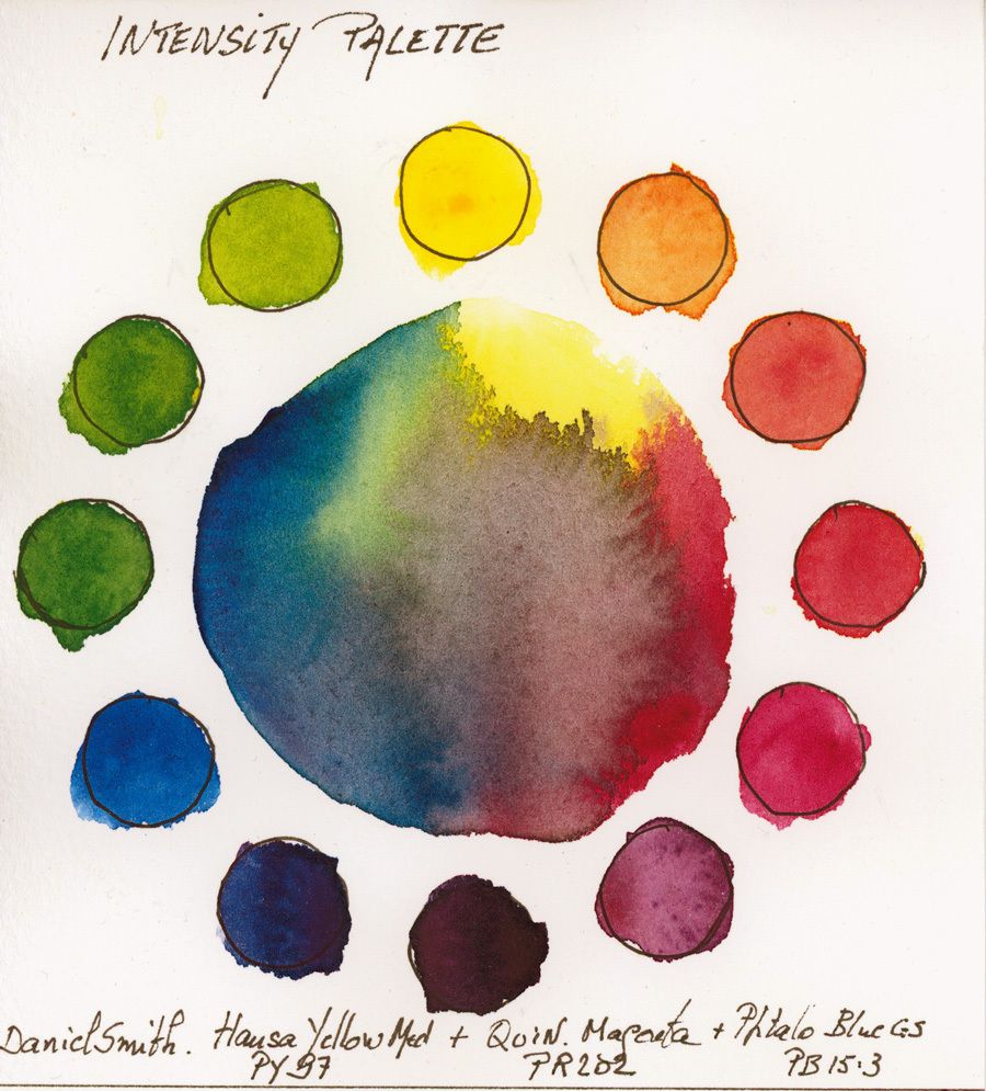
4. The Intensity Palette
We go to the other side of the Atlantic to look for the paintings of Daniel Smith (Fortunately available at Denis Beaux Art in Caen or on his website https://denisbeauxarts.com/.
I selected for this palette, which is a little competitor of the Palette 3 High Contrast, Hansa Medium Yellow <PY97>, Quinacridone Magenta <PR202> and Phthalo Blue green shade.
This triads' shades are very close to the primary colors, which gives with only 3 shades enormous possibilities of mixtures.
5. The Secondary Intensity Triad
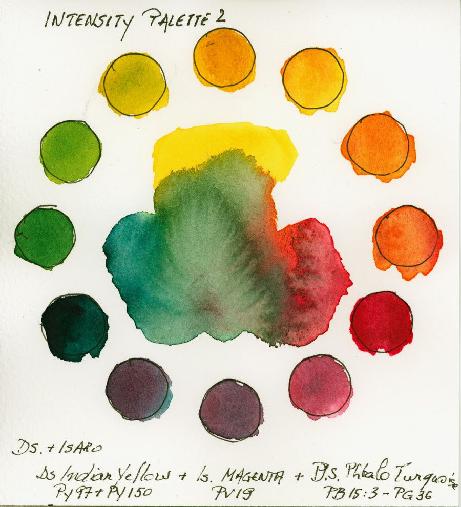
Another Daniel Smith apart from Isaro's Magenta. This triad is composed with secondary colors and is very homogeneous. A triad that allows a brilliant painting with beautiful shades in all mixes. For me one of the best triads to paint flowers.
The triad is composed of Indian Yellow <PY97 + PY150>, Magenta <PV19> and Phthalo Turquoise <PB15: 3 + PG36>.
6. The Secondary Triad
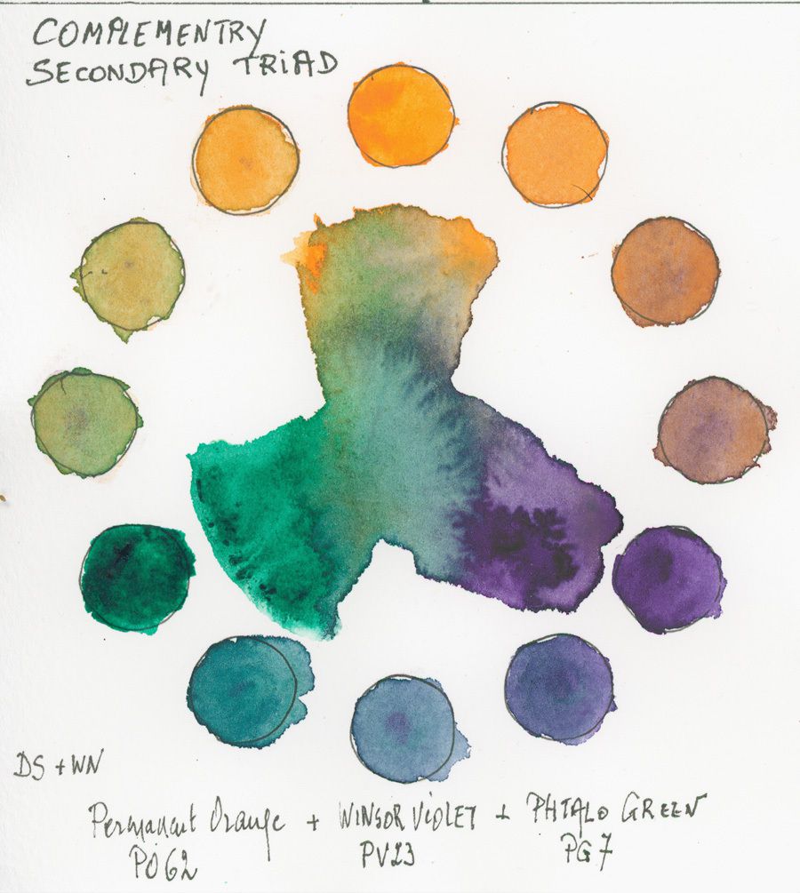
A little confusing not to use primaries, but this triad is well suited for landscapes and seascapes at sunrise or sunset. This palette is made up of paintings by Daniel Smith (Orange Permanent <PO62> and Phthalo Green <PG7>) and Winsor Violet <PV23> by Winsor & Newton.
Naturally, you can modify this palette with less intense colors such as Emerald Green, Purple Outremer, and Indian Yellow ... it's up to you to test.
My tests have already taken me more than 2 days of work at the painting level.
7. The Renaissance Triad
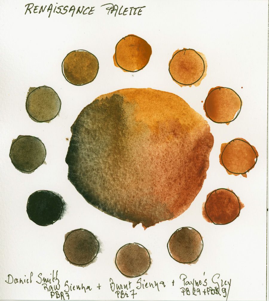
Here we find inspiration in the paintings of Rembrandt, Caravagio etc ...
For old masters triad, I chose paints from the new world ... Daniel Smith. Yet the pigments of the first two are normally of Italian origin, although they are also found in the South of France. Too bad, because at home there is only granite and seaweed;)
The colors are Natural Sienna <PBr7> and Burnt Sienna <PBr7> with Paynes Gray <PB29 + PBk9>.
In order to widen this palette, we can also replace the Siena with Yellow Ocher <PY42> and Paynes gray by Indigo (be careful not compounded with PB29 ultramarine, prefer one made with PB60 Blue Indanthrone significantly less red). This will add greener and slightly purplish shades.
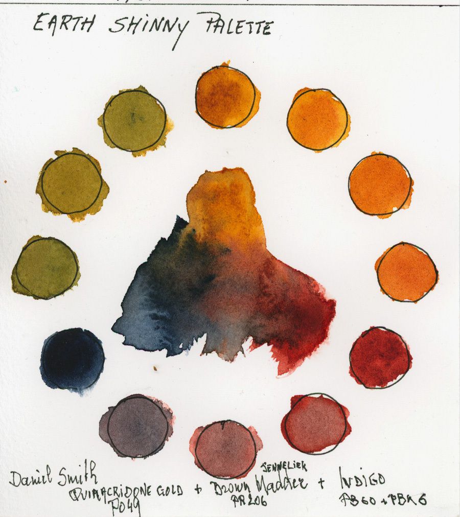
8. The Triad of Shining Earths
Close to the Renaissance triad, but wider in tones, without getting the same shadows, it's a triad that inspires me the fall ... yet we are still waiting for summer, despite the storms that are falling on us today.
I use for this pallet the paintings of Daniel Smith Gold of Quinacridone <PO49> (No more available and replaced by a composition of multi-pigments, which do not have the same characteristics in the mixes .. Consult the article ), the Indigo <PB60 + PBk6> and Senneliers' Madder Brown <PR206>
9. The Opaque Triad
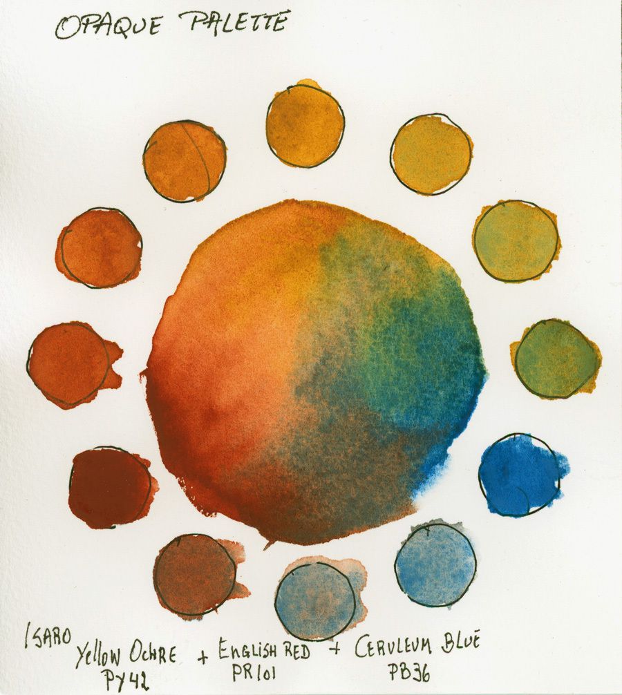
Not to put in all hands. Indeed, when we mix 2 opaque colors, we quickly get dull colors, with 3 hi the damage ...
Yet this combination is very delicate if used in the wet. But it must be applied with a wide brush and let the pigments act. If you start mixing them on paper it's the pure catastrophe.
Honor to the Belgian artisan of color, Isabelle Roelofs, with these watercolor shades ISARO. On the palette are Yellow Ocher <PY42>, English Red <PR101> and Cerule Blue <PB36>.
10. Triad "Opaque" secondary variant
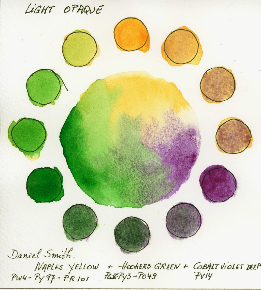
A variation of the triad 8, but much more pastel colored with Daniel Smith secondary colors.
The triad comes with Naples Yellow <PW4 + PY97 + PR101>, Hookers Green <PG36 + PY3 + PO49> and Cobalt Violet <PV14>.
Apart from the same observations as for the opaque triad, here the shades, with the violet, are created with multiple pigments. Given the semi-opacity of the first 2 paints, the opacity of the whole is less pronounced.
11. Muted or Toned Down Triad
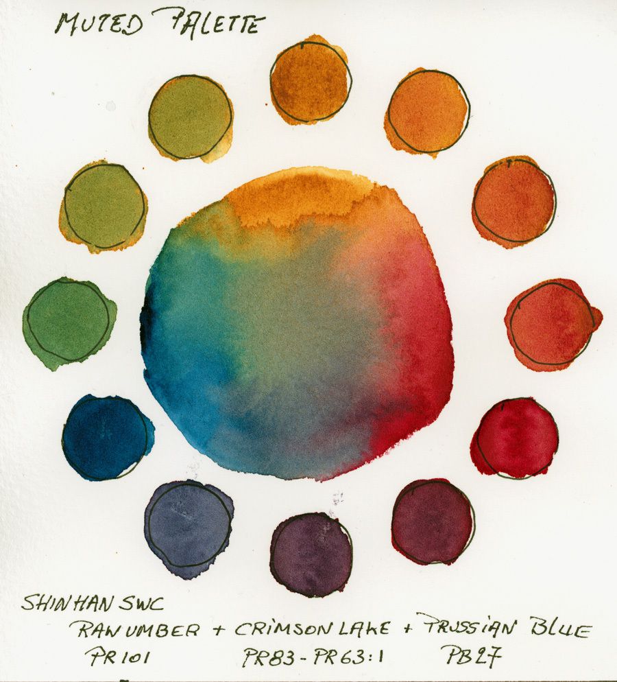
Although the three primaries are present, these shades are darker and muted. This gives a nice effect for late summer landscapes.
The palette is oriental because the paintings are from the Korean manufacturer ShinHAN.
The composition of this triad is Shadow Earth <PR101>, Crimson Alizarin Shade <PR83 + PR63: 1> and Prussian Blue <PB27>.
You can lighten and get more intense oranges and greens by using Yellow Ocher <PY42>.
12. Triad "High Key"
High Key is an expression coming from the world of photography. This indicates that the tones present in the work are of a low value (We use a grayscale whose black is 10 and White 0, in high key the values of all the tones are between 0 and 5).
This gives a very pastel like color triad that can be used in watercolors for children's books and or romantic portraits. This palette is the clearest of High Keys.
The shades used are from Daniel Smith and are near neutral primary colors apart from the Cobalt Blue which has a sub-tone a little green.
The composition is Aureoline (true ... beware of UV resistance ...) <PY40>, Permanent Garance Rose (PR209 + PV19) and Cobalt Blue <PB28>.
We can consider replacing the Rose Madder with a Permanent Rose and Cobalt Blue with a Manganese blue, as for Auréoline, it's very difficult to find an identical replacement ...
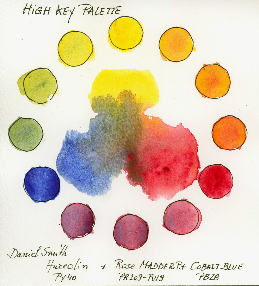
3. Triad "High Key" N ° 2
This Triad is not really High Key, but I place it as such because the dark tones do not exceed 6 on the scale. It is a triad of secondary and thus interesting to explore. Yeah, I have over 120 different shades of Daniel Smith.
I used Quinacrididone Gold <PO49> (see note under Triad No. 7), Quinacridone Violet <PV19>, and Emerald Green <PG18>.
This triad inspires me to paint the French Provence or Italian Tuscany ...
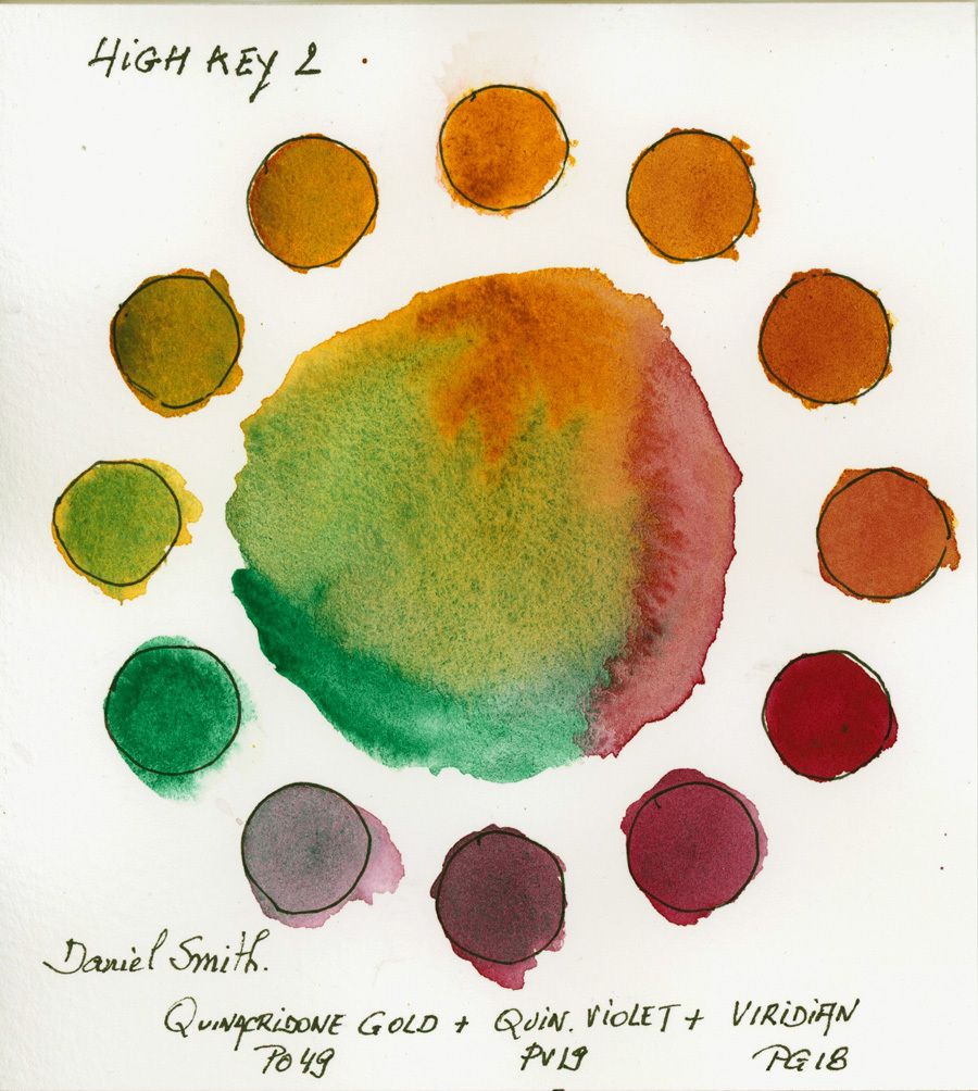
14. Triad "High Key" N ° 3
This is not really a High Key Triad but rather a modified triad, We see that I use a hot yellow, Transparent Yellow <PY150> from Schmincke, which is on the wheel at 1 hour, Quinacridone Magenta <PR122> Blockx, which is at 5 o'clock and a Manganese Blue from Daler & Rowney <PB15: 3>, which is at 9 o'clock.
You notice that I have moved slightly (by one hour "my colors." This is very interesting to find triad variants.
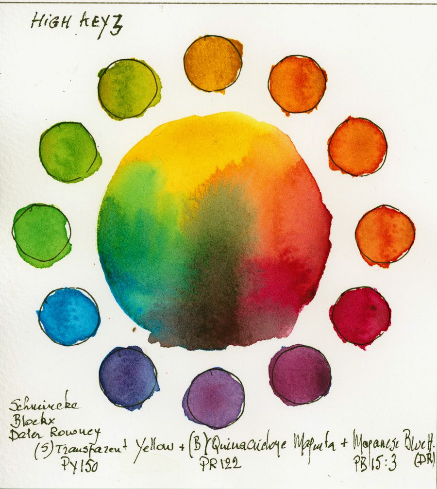
15. Triad "High Key" N ° 4
This triad is almost identical to the previous one with this difference in choice of yellow and a magenta compound with other pigments.
The colors are Daniel Smith Yellow Azo <PY151>, Quinacridone Magenta <PR202> and Manganese Blue Tint <PB15>.
It is a very transparent and fresh combination to paint wildflowers, a spring landscape etc.
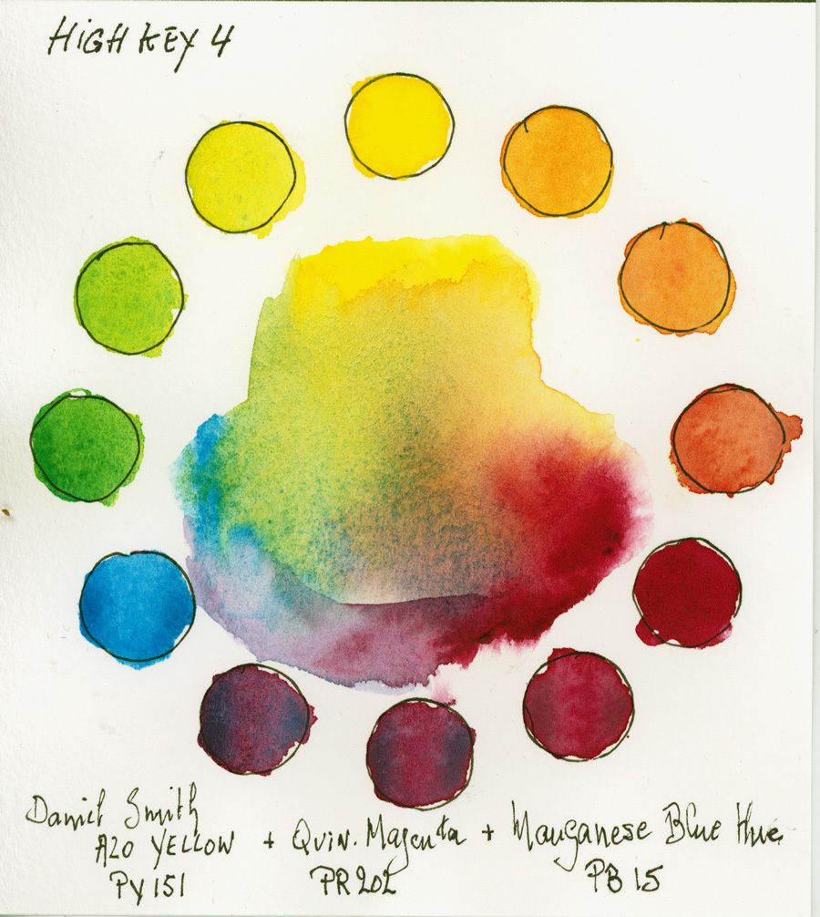
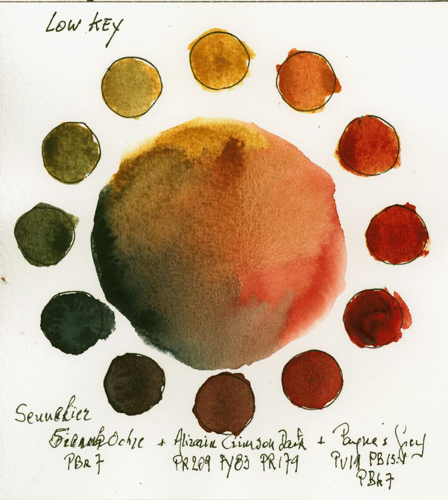
16. Triad "LOW Key"
Unlike High Key, the low key is a triad created with hues of strong values, resulting in a harmoniously dark ensemble. A palette to interpret night, winter or dark landscapes.
This triad is closer to the renaissance palette but with a little more vibrant.
Here are some nuances from Sennelier that make up this palette; Sienna <PBr7>, Dark Alizarin Crimson <PR209 + PY83 + PR179> and Paynes Gray <PV19 + PB15: 1 + PBk7>.
A remark anyway, from the natural Siena, the other 2 colors have a composition with multiple pigments, which does not facilitate mixing.
I advise you not to mix them and put them in wet in wet without coming back, otherwise, it will make the mixtures dull. If you want to avoid this, use a <PR101> brown mono-pigment instead of Alizarin Crimson Dark and a neutral Blue (see my article on blue pigments for the best neutral) instead of Payne's Gray.
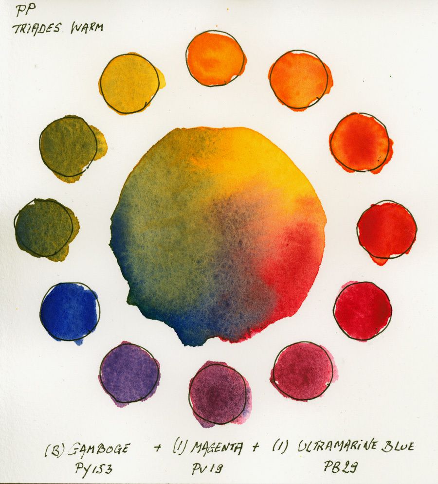
17. Triad Limited Palette of 13 colors Warm version
Here and in all triads, whose picture is indicated PP, I use the colors that make up my palette that I commented in the article on the Ultimate Palette 13 colors ( link: http://www.desireherman.com/2017/09/the-ultimate-palette-of-13-colours-to-paint-all-your-watercolour-art.html )
We obtain beautiful oranges and purples and greens duller, this due to the use of a warm blue (Ultramarine) and a hot yellow (Gamboge).
The triad consists of Blockx Gum Gum <PY153>, Magenta Isaro <PV19> and Blue Isard Ultramarine <PB29>.
This warm triad shows us a beautiful harmony.
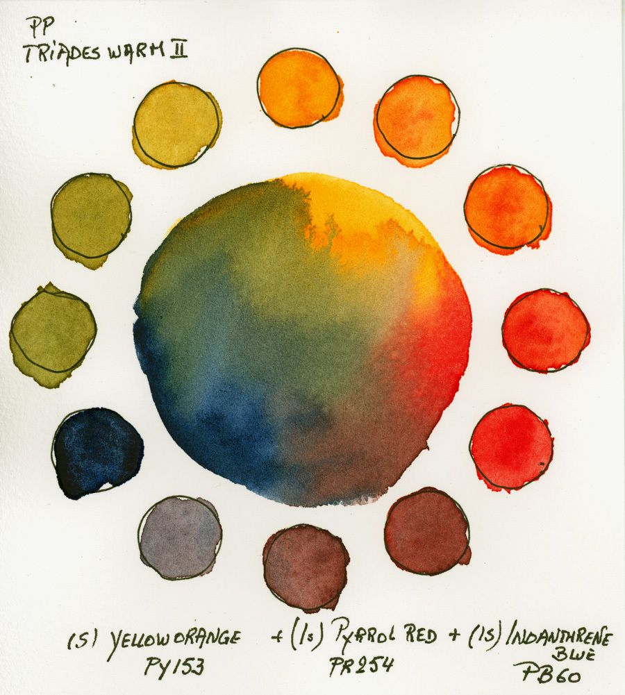
18. Triad Limited Palette 13 colors Warm version 2
The difference from the previous one is that I use here a slightly less vibrant yellow, a warmer red and a darker and less warm blue.
This results in mixtures of beautiful violets and oranges and very olive style greens, so muted and natural. All shades come from Isaro, apart from the yellow that is Schmincke) and include orange yellow <PY153> Pyrrole Red <PR254> and Indanthrene Blue <PB60>.
This triad may be suitable for the same subjects as the previous one.
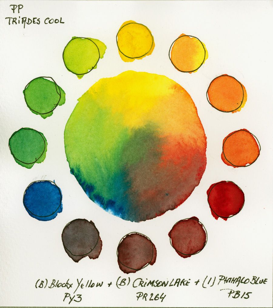
19. Triad Limited Palette 13 colors Cold version 1
After the warm the cold. A cold triad mixes purer greens and shades of turquoise.
Unlike warm triads, purple and orange are duller. The triad is made up of Blockx Alizarin Black Crimson Blockance <PY3> Blocky <PR264> and Isard Phthalo Blue <PB15>
A fresh spring triad.
20. Triad Limited Palette 13 colors Cold version 2
This triad uses a very granular blue, but much less deep than the blue Phthalo in the previous triad.
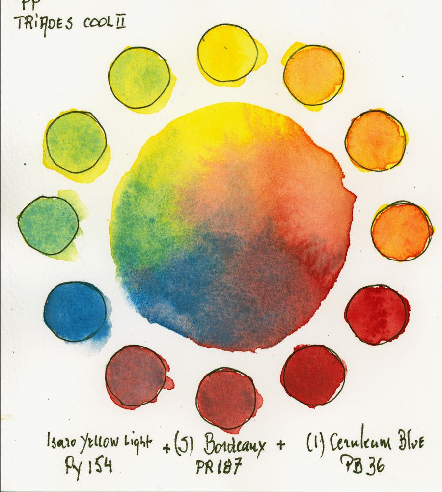
The use of Bordeaux (a little less cold than Alizarin) results in oranges a little less muted.
This triad can open the way for portraits studies, but its weak point is that it is difficult to obtain very dark tones, and the Bleu Ceruléum is opaque, but not tinting ... II have to go further with my research
The triad is composed of Clair d'Isaro Yellow <PY154>, Bordeaux de Schmincke <PR187> and Bleu Ceruleum Isora <PB36>.
21. Triad Limited Palette 13 colors Secondary version
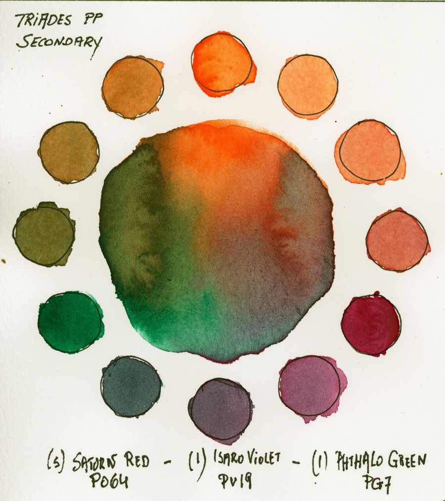
For this triad I use the secondary colors of the limited palette.
This triad is very harmonious, calm and quite dark. I see myself painting a village in Provence at dawn or sunset or a marine with.
This triad features Schmincke's red Saturn <PO64>, Isaro's Violet <PV19> and Isaro's Phthalo Green <PG7>
A palette to distinguish oneself from others ...
22. Low Triad Intensity
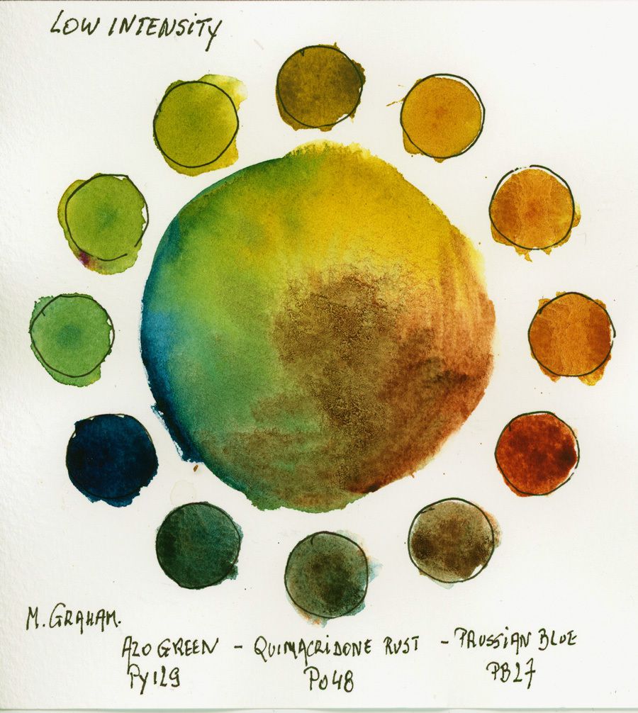
For this triad, I use colors from the American manufacturer Mr. Graham.
All colors are quite dark and could have been on a palette of old masters.
The texture created by Quinacridone Rust and Azo Green (it's a yellow) are very subtle.
A beautiful triad for landscape painters.
This triad features Azo Green <PY129>, Quinacridone Rust <PO48> and Prussian Blue <PB27>.
23. Triad of Low-Intensity Modern
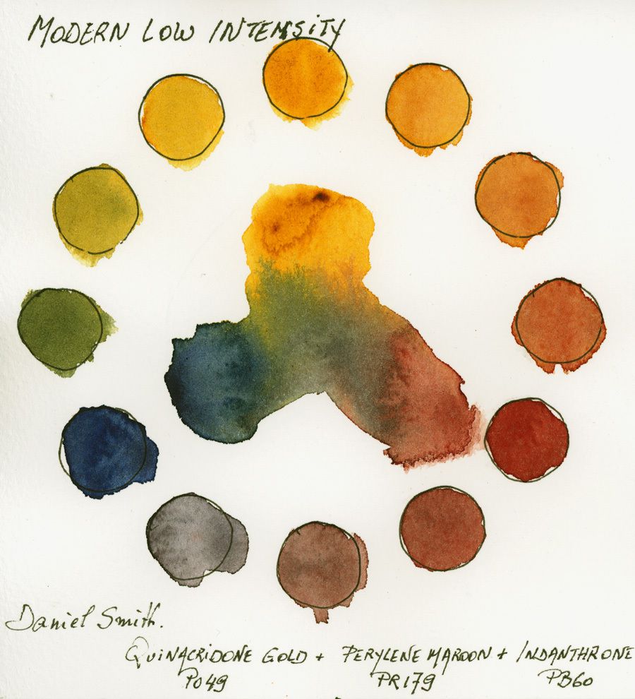
The colors of this triad are by Daniel Smith and the triad composed with them is one of my favorites by its natural aspect, which, apart from the flowers, is a very subtle triad and a beautiful harmony.
The triad consists of Quinacridone Gold <PO49>, Perylene Brown <PR179> and Indanthrene Blue <PB60>.
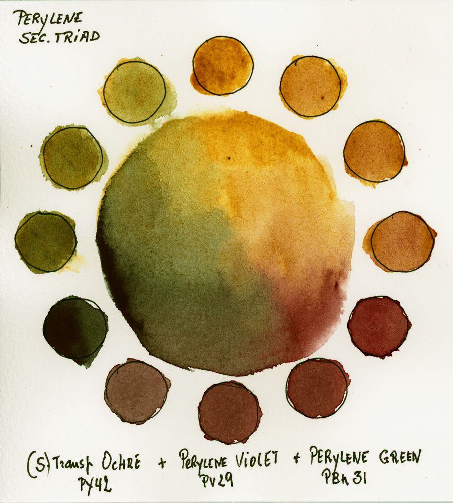
24. Triad of the Perylenes
It is a choice of almost secondary colors, using quite recent pigments, this apart from the transparent ocher but Ocher wasn't so transparent before ...
These colors are part of the new colors that Schmincke launched for her 125th anniversary.
This trio makes it possible to constitute a pallet of rather low contrast, but which can be very dark if one mixes the three together.
This triad includes Transparent Ocher <PY42>, Perylene Violet <PV29> and Perylene Green <PBk31>.
25. Triad of Split Complementaries
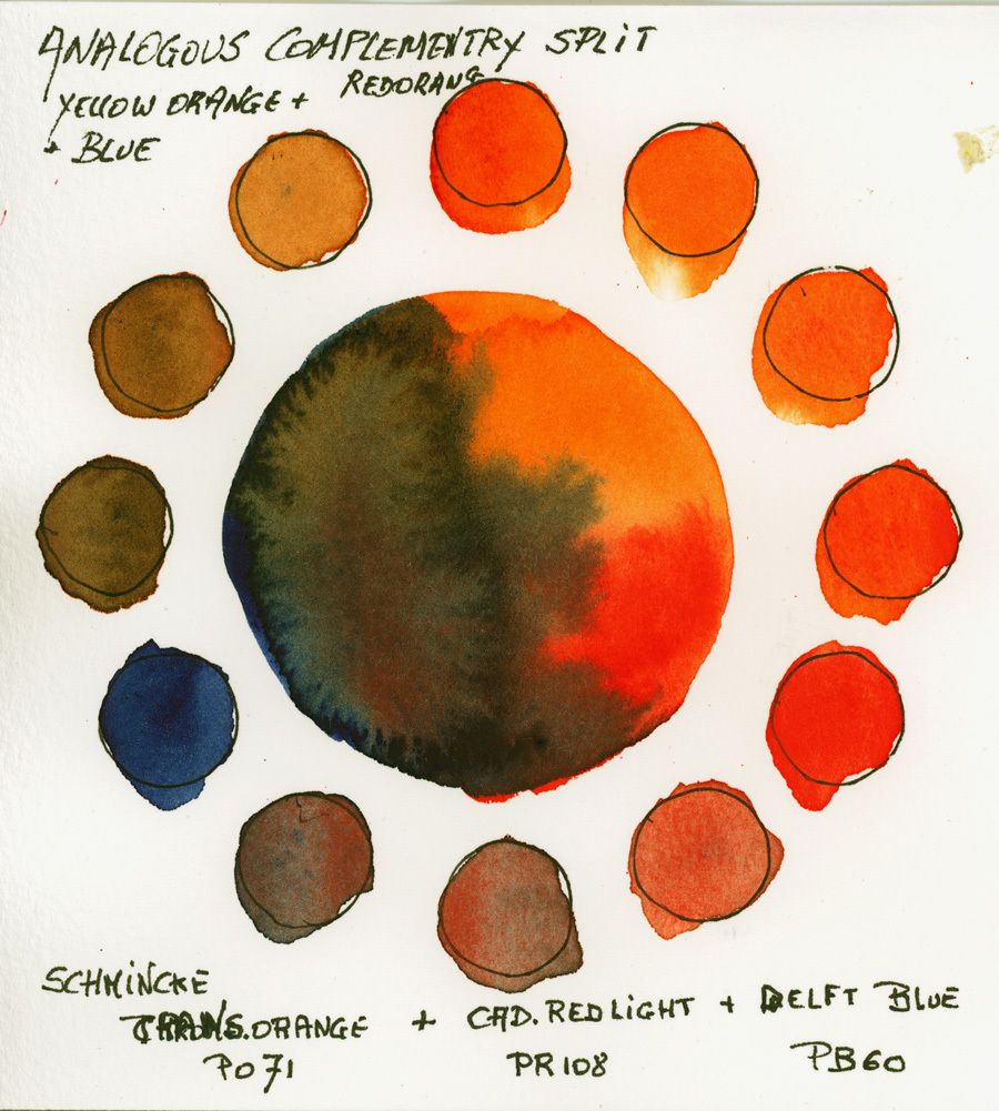
To choose a separate complementary scheme, there are many possibilities ...
For example, the red and its green complement, the yellow with its violet complement etc ... this also applies for the secondary or tertiary ones.
Here I chose the blue with the orange complement, but instead of using an orange, I separated the orange using an orange (I could have used a yellow-orange also style Gum Gutte) and a neutral red a little hot. This gives more shades in the mixes to create the dark tones.
For this triad I used only Schmincke Horadam tubes; transparent orange <PO71>, light Cadmium Red <PR108> and Delft Blue 'Indanthrene) PB60
26. Tetrad of complementary doubles
A little explanation on the tetrads. The tetrads are composed of a choice of 4 colors, chosen on the color wheel by selecting the shades by placing a rectangle or square on it.
Here are some examples ...
For these tetrads we have different possibilities ...
We choose;
- * A magenta, a green, a purple and a yellow
- * An orange red, a green blue, a yellow and a purple
- * One red, one green, one purple and one yellow,
- * One red, one green blue, one purple and one yellow Etc ...
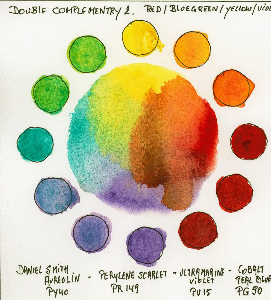
The first example of a tetrad. Here it is a red, a blue-green, a purple and a yellow that I use
All colors are from Daniel Smith and my choice was,
- Aureoline Yellow <PY40>,
- Scarlet Red <PR149>,
- Ultramarine Violet <PV15>
- Teal Blue <PG50>
27. Tetrad of complementary doubles 2
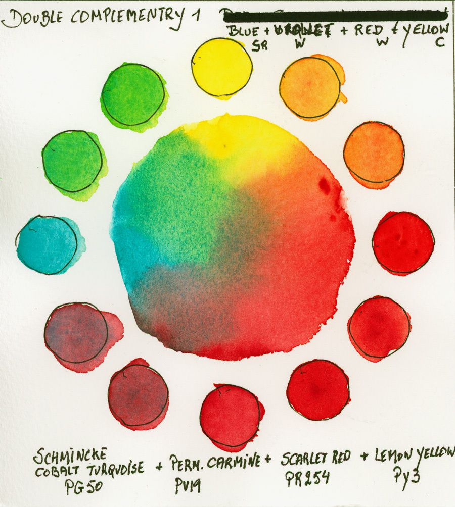
To achieve this tetrad, I opted for a more secondary positioning with the choice of a cold green, a yellow and almost neutral red and a violet.
I used my Horadam colors from Schmincke;
- Blue-green is Cobalt Turquoise <Pg50>
- purple (red tone) is Permanent Carmine <PV19>
- red is scarlet <PR254>
- yellow is Lemon Yellow <PY3>.
It is the same composition as the previous one, but note the differences in the choice of different pigments, close in nuance, but different in behavior.
This proves once again that will be tested and will explore your technique. These combinations are very bright ...
I'll explain triads, tetrads in depth later in another article if there are enough requests to do this work ...
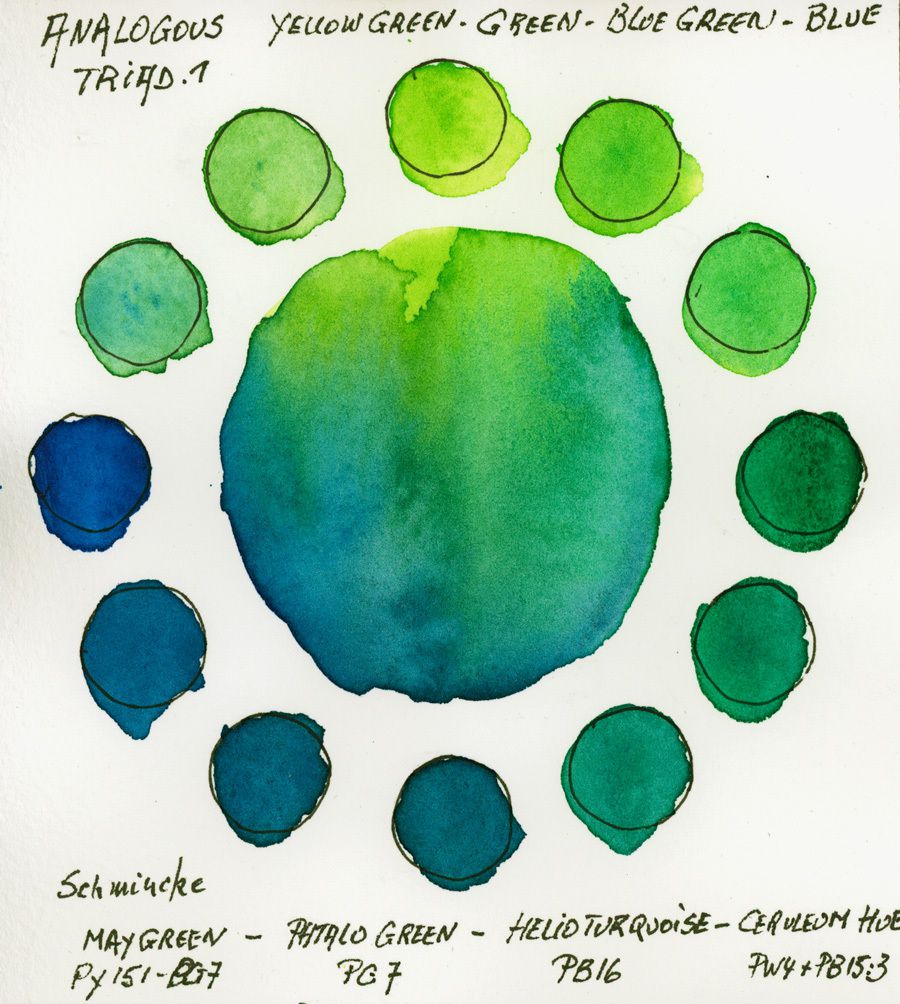
28. Analogous tetrad 1 version Green Blue
Here I retain the Green-> blue version with colors Schmincke Horadam;
- * Green-yellow: May green <PY151 + PG7)
- * Green: Phthalo Green <PG7>
- * Bluish Green Helio Turquoise <PB16>
- * Greenish blue: Cerulean tint <Pw4 + PB15: 3>
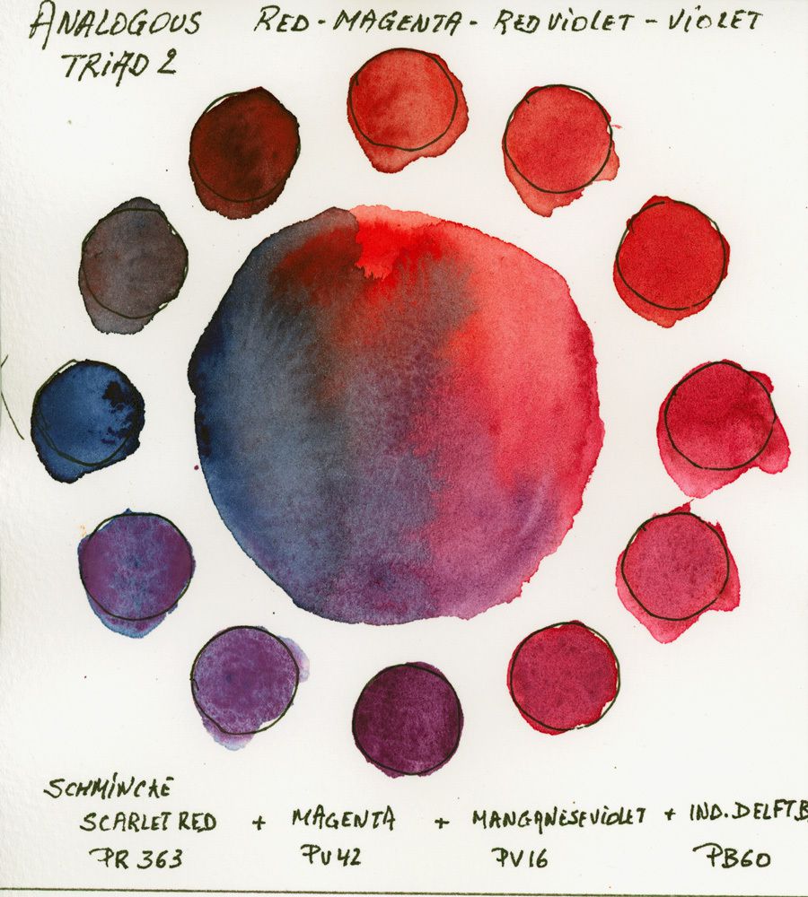
29. Analogous Tetrad 2
This analogous tetradic goes from red to blue with new colors from Schmincke.
Here I choose;
- * The scarlet red <PR254>
- * The Magenta <PV42>
- * The Manganese Violet <PV16>
- * Delft Blue (Indanthrene) <PB60>
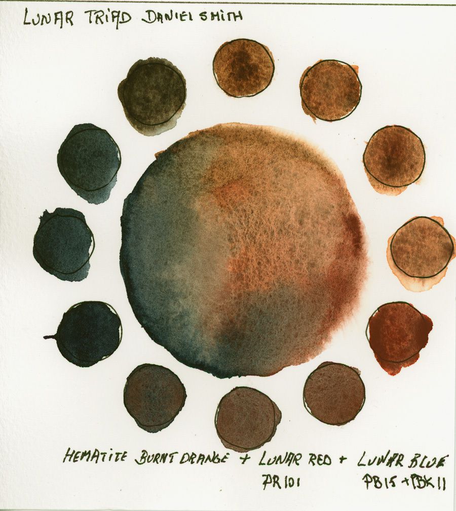
30. The Lunar Triad
This triad highlights the "Lunar" colors from Daniel Smith.
These colors are very granulating and produce very beautiful flocculation and granulation structures.
A discovery for using it to paint sand, rocks to see beaches ...
This Triad is composed of;
- * Orange burnt original Hematite
- * Lunar Red <PR101>
- * Lunar Blue <PB15 + PBk11>
All triads have been commented. I only have to find the subject I'm going to paint with these mixes.
I look forward to see your comments as I'll post everyday in June the watercolour painting of the day you on this blog in the section 1 Painting a Day and on my Facebook group page L'Aquarelle de Désiré https://www.facebook.com/groups/188991018226366/ (Private, but make a request and I will approve your membership)
I will post progressively the achievements and if you have proposals to make, do not hesitate to submit them to me ... So I go back to my brushes and good luck to you.
Source: https://www.desireherman.com/2018/05/watercolor-challenge-30-triads-for-30-paintings-june-2018.html
0 Response to "Paintings Done in the Triad Green Redorange Blue Violet"
Publicar un comentario